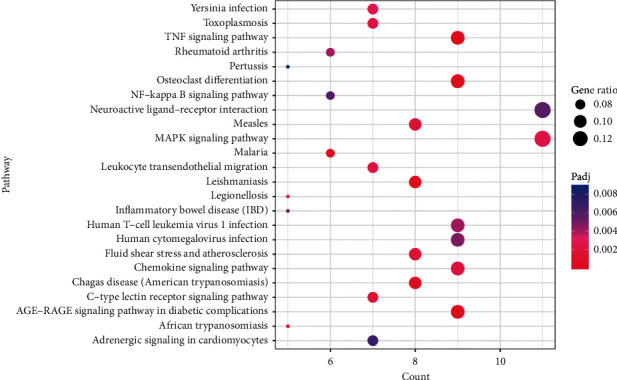
Figure 4.

The bubble diagram exhibiting the pathways for the intersected target proteins. The vertical axis represents the pathway name, while the horizontal axis shows the enrichment gene number. The larger the ratio of enriched genes to the total genes, the larger the dot size is. A brighter red dot indicates a smaller p value.
