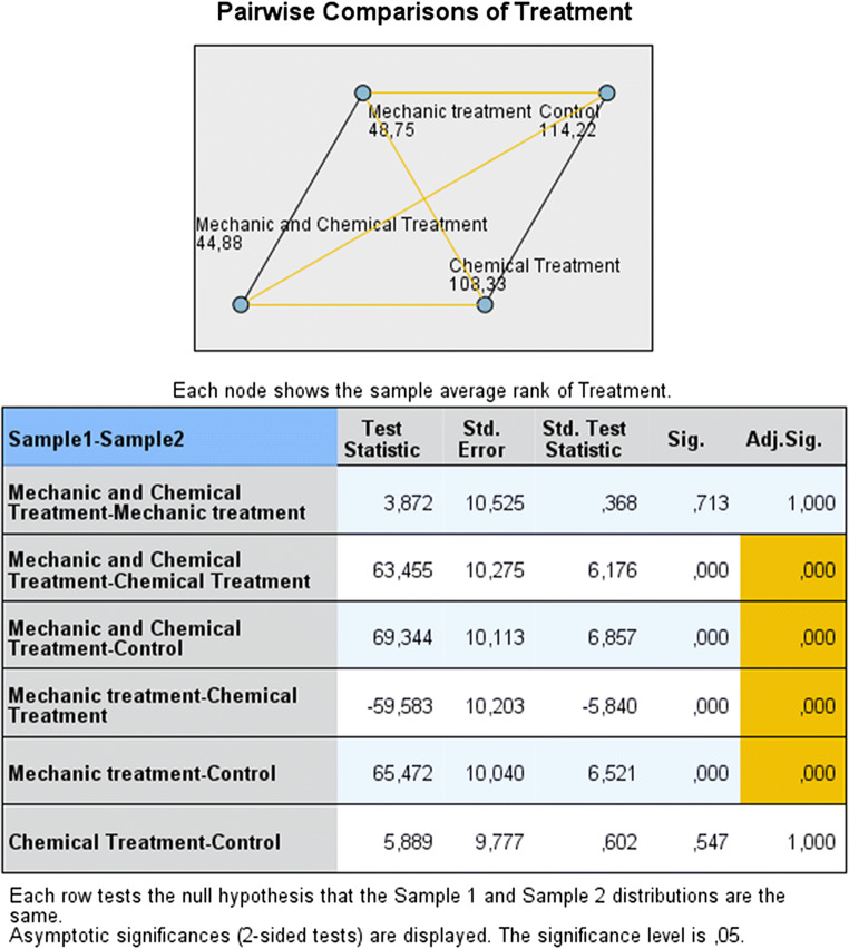
Fig. 3.
Pairwise comparison of decontamination methods. In the diagram, the numbers and the joining lines reflected respectively the average rank and the pairwise comparison for each group. Orange and black lines reflected pairwise comparisons, respectively statistically significant and not significant. The table below the diagram showed pairwise comparisons in more detail: the first column indicated which pairwise comparison was made and in what direction; the second column reported the test statistic (difference between mean ranks of the two groups); the third and fourth columns presented the standard error and the standardized statistic test; the fifth and the sixth columns showed the unadjusted and adjusted p value.

