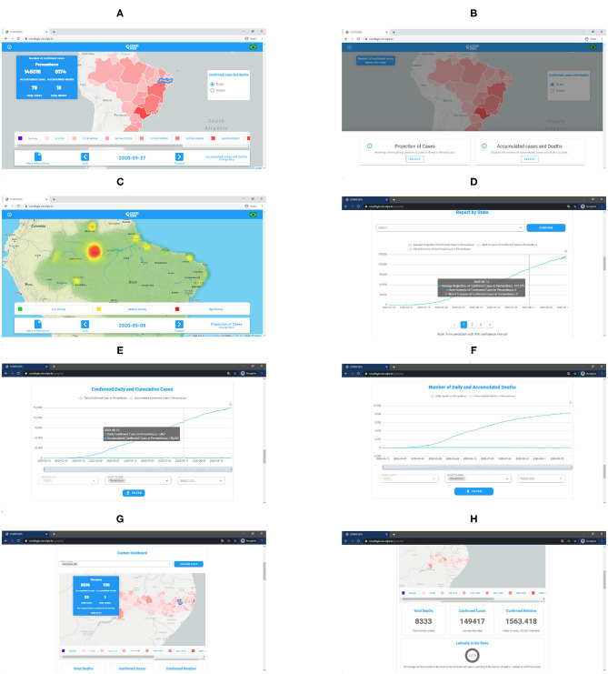
Figure 8.
(A) COVID-SGIS home screen. (B) Map selection screen, wherein it is possible to visualize the cumulative cases' map and the forecasted distribution maps. (C) Screen of the prediction of the distribution maps of the cumulative cases of Covid-19. (D) Accumulated cases of Covid-19 forecast graph with ARIMA. The green line represents the ARIMA forecast, whereas the red and the blue lines represent the worst and the best scenario. Screen of the graphs for accumulated and daily confirmed cases (E), and accumulated and confirmed deaths (F). Screens of the personalized dashboard (G,H). The personalized dashboard gives detailed information—regarding the cumulative confirmed cases and daily cases, and cumulative deaths and daily deaths—for each state at a municipality level).

