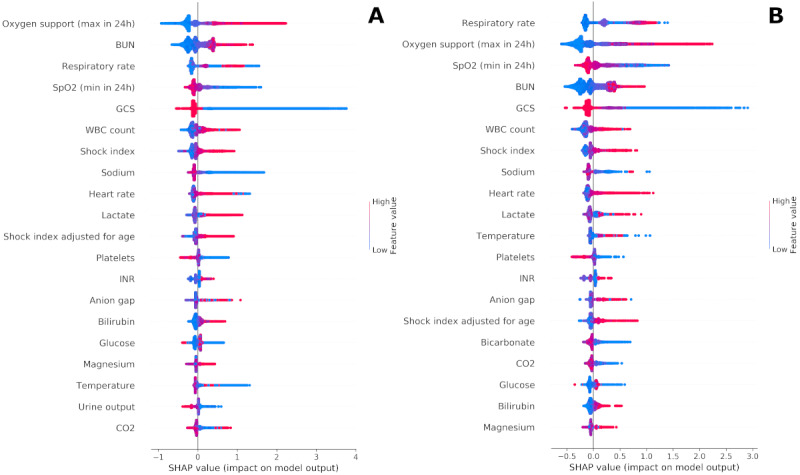
Figure 4.

Shapley summary plots. Panel A depicts an aggregated summary plot of the Shapley values from the 2019 test set, while panel B corresponds to COVID-19 positive patients. The 20 most influential features are ranked from top to bottom, and the distribution of Shapley values across all predictions are plotted. The magnitude of the Shapley value is displayed on the horizontal axis, while the value of the feature itself is represented by color. For example, a large amount of oxygen support over 24 hours (red) in panel A was associated with a highly positive influence on the model, while low to no oxygen support (blue) pushed the model back toward 0. BUN: blood urea nitrogen; GCS: Glasgow Coma Scale; INR: international normalized ratio; SHAP: Shapley; WBC: white blood cells.
