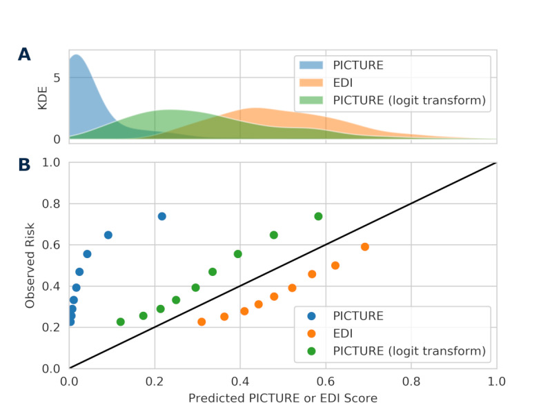
Figure 5.

Distribution of scores and calibration curve. Panel A presents a KDE of the distribution of PICTURE and EDI scores. In addition to raw PICTURE scores, logit-transformed scores are also included. Panel B depicts quantiles of PICTURE and EDI scores (0.1, 0.2, 0.3,...0.9) against observed risk. Neither PICTURE nor the EDI are calibrated as probabilities, and as such, the use of set alarm thresholds may be useful to help alert clinicians when their patient is at an increased risk. EDI: Epic Deterioration Index; KDE: kernel density estimate; PICTURE: Predicting Intensive Care Transfers and Other Unforeseen Events.
