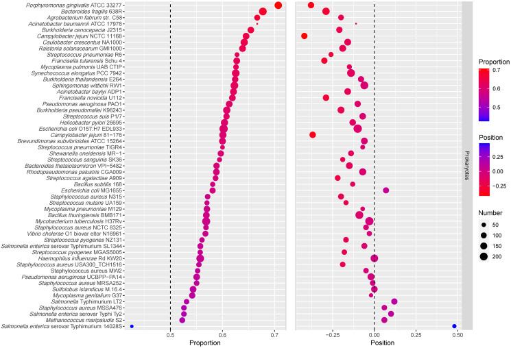
Fig 2. Bubblechart of essential genes proportion and the relative positions.
In the left part of the figure, the size of the dot represents the number of essential genes occupying the first half of operons, and the color of the dot represents the proportion of essential genes occupying the first half of operons. The part on the left is sorted according to the proportion of essential genes in the first half of operons from high to low. In the right part of the figure, the size of the dot represents the number of operons, and the color of the dot represents the relative positions of essential genes.

