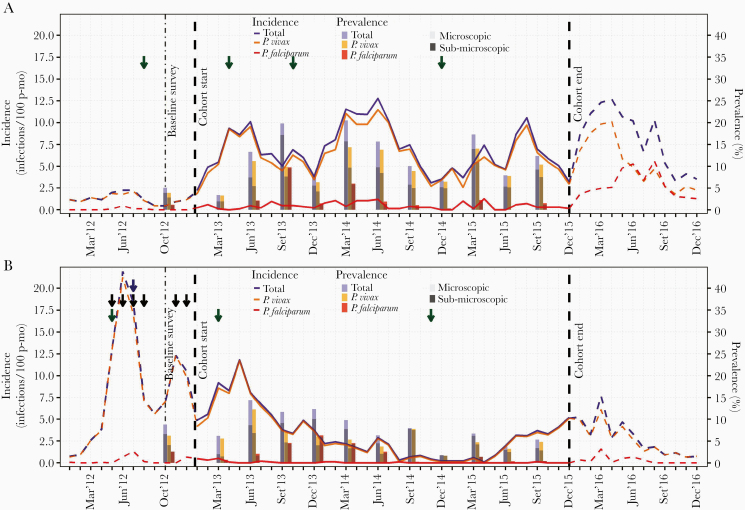
Figure 4.
Evolution of monthly incidence of malaria infections by microscopy, and quarterly prevalence by qPCR in Lupuna (A) and Cahuide (B) from January 2012 to December 2016. Dashed lines represent incidence in 2012 and 2016 estimated with surveillance data, while solid lines in 2013-2015 with cohort data. Green, blue, and black arrows indicate months when respectively indoor residual spraying (IRS) with 5% deltamethrin, distribution of long-lasting insecticidal nets (LLINs), and population screenings using microscopy and treatment of confirmed infections were conducted. The left Y-axis indicates incidence rates (number of infections/100 person-months), while the right Y-axis prevalence in percentage (%). see online version for color figure.

