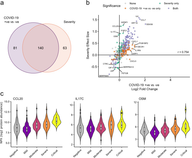
Figure 6. Comparison of proteins differentially expressed in COVID-19 with those associated with clinical severity.
(a) Overlap between the proteins significantly differentially expressed in COVID-19 (n = 256 COVID-19 samples and 51 non-infected samples) versus those associated with severity (within-case analysis, n = 256 samples) (subcohort A). 5% FDR was used as the significant cut-off in both analyses. (b) Comparison of effect sizes for each protein in the COVID-19-positive versus -negative analysis (x-axis) and severity analysis (y-axis). Each point represents a protein. Pearson’s r is shown. (c) Examples of proteins specifically associated with severity, but not significantly differentially abundant in the comparison of all cases versus controls. Violin plots showing distribution of plasma protein levels according to COVID-19 status at the time of blood draw. Boxplots indicate median and inter-quartile range. n = 256 samples from 55 COVID-19 patients and 51 samples from non-infected patients. WHO severity indicates the clinical severity score of the patient at the time the sample was taken. Mild n = 135 samples; moderate n = 77 samples; severe n = 29 samples; critical n = 15 samples.

