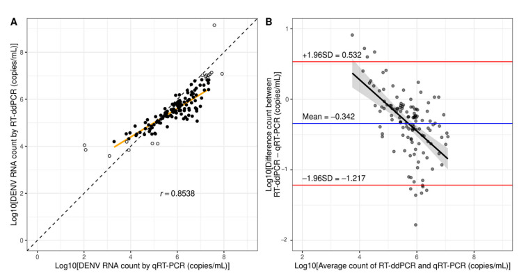
Figure 4.
Comparison of quantification results between RT-ddPCR and qRT-PCR. (A) A regression line (orange) shows the correlation between dengue RNA from clinical samples measured by qRT-PCR and ddPCR. The diagonal line represents a hypothetical trend where results by the two methods are identical. The solid dots represent measured counts within the limit of quantification. The open dots represent measured counts below LLOQ or above ULOQ which were not included in the analysis. (B) Bland–Altman plot shows the limit of agreement between qRT-PCR and RT-ddPCR (red lines). The horizontal blue line shows the mean difference between the two methods (bias). A linear regression line and a confidence area show an association between measured counts and bias.

