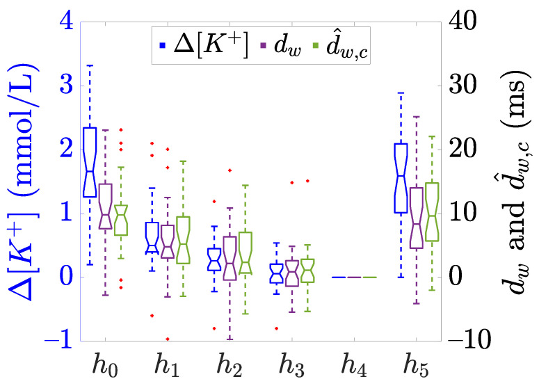
Figure 2.
Boxplots showing the distribution of (blue) and the described -based time warping biomarkers (purple) and (green), computed at each time points ( to ), see Figure 1. The central line of the boxplots represents the median, the edges of the box are the 25-th and 75-th percentiles, and the whiskers extend to the most extreme data points not considered as outliers. The notches represent the 95% confidence interval of the median, calculated as and + being the median, and are the 25-th and 75-th percentiles, respectively, and n is the sample size. Finally, red “+” denotes outliers. Data adapted from [20,21].

