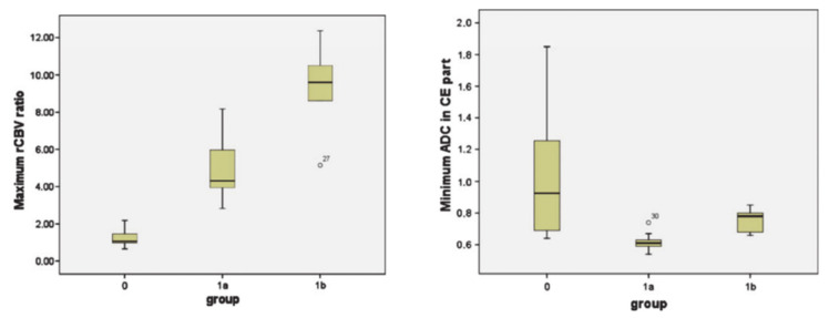
Figure 8.
Box-and-whisker plots demonstrating the distributions of maximum relative cerebral blood volume (rCBV) ratios (left panel) and minimum ADC (right panel) from three groups (group 0: patients who remained stable during the follow-up period; group 1a: patients who were suspected but not confirmed with TP; group 1b: patients who were definitive TP). The bottom and top edges of boxes represent the 25th percentile and the 75th percentile values. The bands within the boxes represent 50th percentile (median) values. Whiskers display the range of data distribution. Outliers are marked with open circles. Reprinted with permission from ref. [110]. Copyright 2010 Springer-Verlag.

