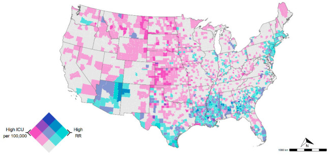
Figure 3.
Intensive care units (ICU) bed availability per 100,000 (ICU information was not available in AK and HI). Dark purple indicates counties with high ICU availability and low mortality risk, whereas areas in darker green-blue indicate counties with high mortality risk but low ICU availability. Both variables were classified with a tertile scheme as follows: COVID-19-related RR (0–1 lower risk, 1–3 medium risk, and 3 > high risk) and ICU beds per 100,000 (<28.4 low availability, 28.4–100 medium availability, and >100 high availability).

