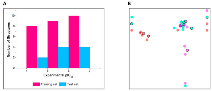
Figure 1.
(A) Distribution of the dataset into training and test sets according to pIC50 ranges. (B) Structural similarity map. The encircled points represent test set compounds. Structural similarity is inversely proportional to the distance between the points, and the colors represent pIC50 intervals. Red: 4.00–5.06; cyan: 5.07–6.12; and magenta: 6.13–6.92.

