
Fig. 4.
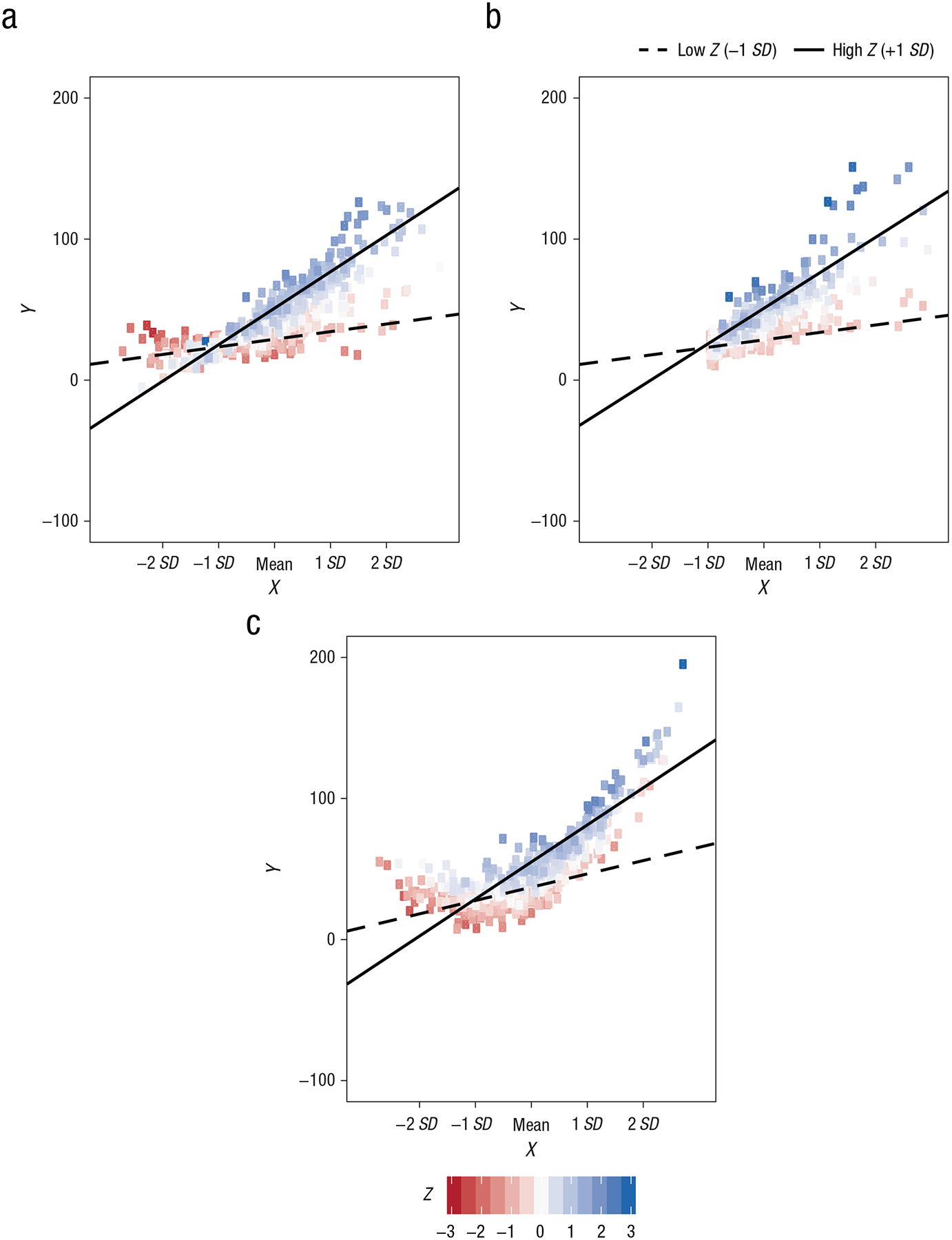
Illustration of the impact of nonnormality on the interpretation of simple slopes. The three scatterplots show regression lines and observed data for the XZ interaction in Example 1, simulated from different predictor distributions. Although the simple slopes are nearly identical in the three graphs, the interaction patterns evident in the observed data differ according to whether the predictors (a) are normally distributed, (b) have skewed distributions, or (c) are strongly correlated (i.e., the interaction is confounded with a quadratic effect of the focal predictor). For Z, low refers to 1 SD below the mean, and high refers to 1 SD above the mean.