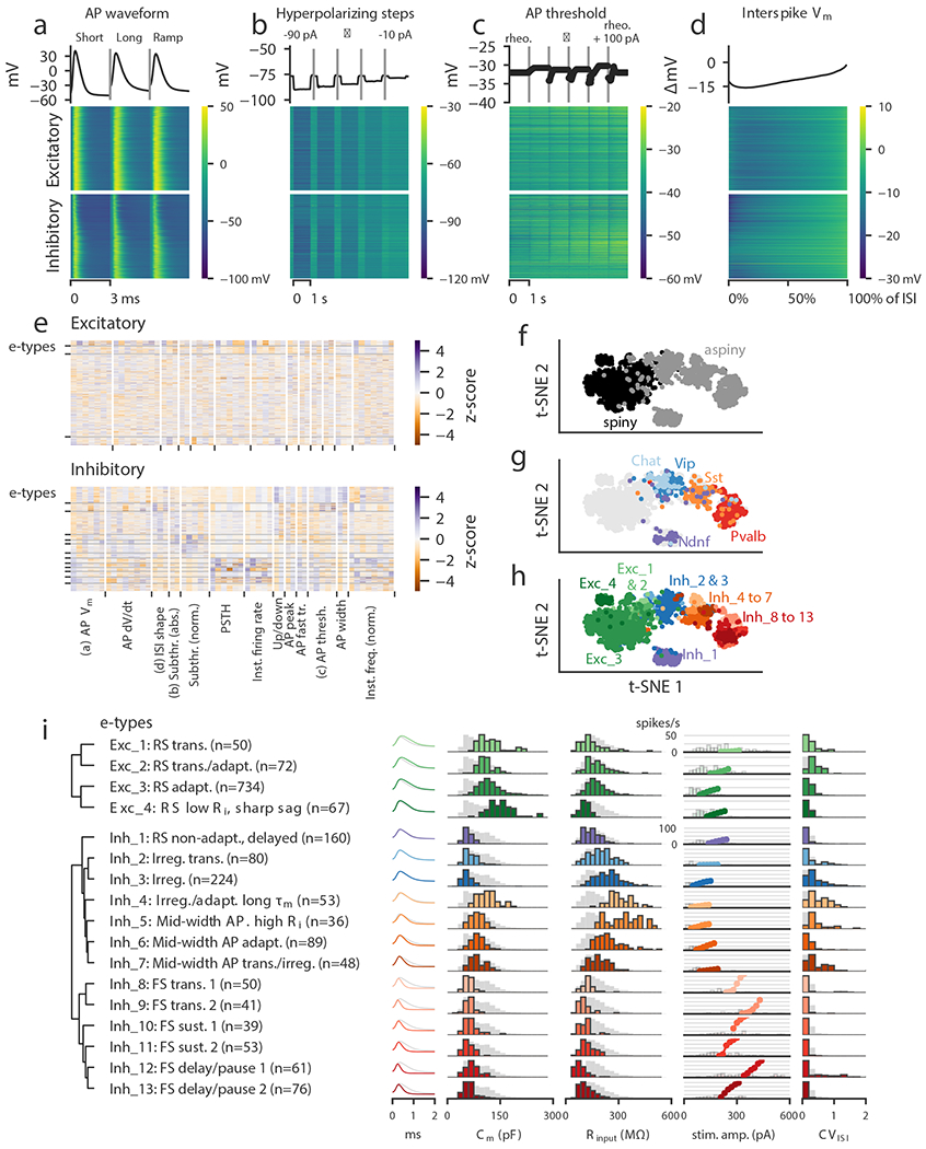
Figure 2: Classification of electrophysiological properties.

(a) Action potential waveforms of n=1,938 cells evoked by a short (3 ms) current pulse, a long square (one second) current step, and a slow current ramp (25 pA/s). Example trace (top) and heat map of all responses (bottom). The cells in the heatmap are split into excitatory (spiny) cells above and inhibitory (aspiny/sparsely spiny) cells below (as determined from the images of each cell), and ordered within each of those groups by their average upstroke/downstroke ratio during long square current steps. The order of cells is the same in the heat maps of (a)–(d). In (a)–(c), vertical lines shown within examples separate data collected from different sweeps. (b) Membrane potential responses to hyperpolarizing current steps. (c) Action potential threshold voltages of spikes evoked by a series of depolarizing current steps. (d) Interspike interval membrane potential trajectories. For a given sweep, each interspike interval duration was normalized, resampled to have a consistent number of points, aligned on the action potential threshold (set to 0 mV), and averaged together. (e) Sparse principal component values collected from each data type, indicated by labels at the bottom. Each component’s values were transformed into a z-score. Rows are sorted into clusters indicated by left tick marks. (f) t-SNE plot using the components shown in (e) with aspiny/sparsely spiny (collectively referred to as “aspiny”) and spiny neurons identified (n=1,938 cells). The same t-SNE plot is shown in (f-h). (g) t-SNE plot with selected inhibitory-dominant transgenic lines identified. Only aspiny neurons from those lines are shown. (h) t-SNE plot with electrophysiology types (e-types) identified. (i) E-types and specific features. Dendrogram on left was created by hierarchical clustering based on distances between each cluster’s centroid. For AP shape, e-type averages are shown as colors and the grand average across all cells is shown in gray. For histograms, e-type values are shown in colors and full population is shown in gray. All histograms are scaled to their highest value. The f-I curves were aligned on the rheobase value and averaged. The average curve is plotted starting at the median rheobase. Distribution of rheobase values for cells in the clusters are shown as histograms behind the average curve.
