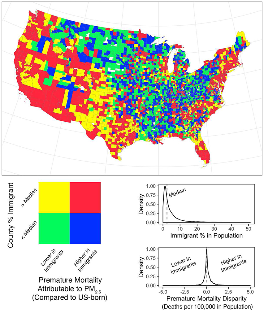
Figure 2:

Disparity between Immigrants and the US-Born in Premature Mortality Attributable to PM2.5 Exposure in 2010. The coloring scheme indicates whether a county had higher or lower estimated premature deaths attributable to PM2.5 in immigrants compared to the US-born (positive or negative premature mortality disparity) and whether the county was in the upper or lower half of county immigrant population proportions nationally. Counties with any Census tracts with zero immigrants were shaded in white. Density plots for each measure with its median value (dotted line) are also shown.
