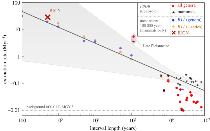
Figure 3.
The extinction rate as measured (following equation (2.3)) across geological stages of varying duration, given by the x-axis. Red circles represent all Cenozoic genera, with black stars the mammal-only subset of those genera. Blue points are extinction rates at the genus level as compiled by B11 over the past 100 000 years, with orange points the equivalent species extinction rates. The black line is a linear regression to the mammal only PBDB data with associated confidence limits in grey. The IUCN Red List information as of 2019 is given by the red cross. (Online version in colour.)

