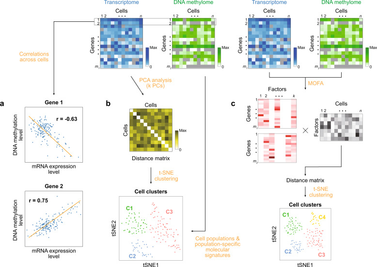
Fig. 5. Strategies for the integrative analysis of single-cell multiomics data.
Blue and green heat maps represent the data matrixes for the transcriptome and DNA methylome, respectively. The symbols n, m1, and m2 denote the numbers of cells (n) and genes with the levels of mRNA (m1) and DNA methylation (m2). Colors in the heat maps represent the levels of mRNA and DNA methylation (see color bars; Max, the maximum level). a Correlation analysis between mRNA and DNA methylation levels. Scatter plots show mRNA and DNA methylation levels for genes 1 (top) and 2 (bottom). Line, regression line; r, Pearson correlation. Negative and positive correlations are shown for genes 1 and 2, respectively. b Analysis of scRNA-seq data followed by the integration of scBS-seq data. Principal component analysis (PCA) is first applied to scRNA-seq data to obtain score values for k PCs, the pairwise Euclidean distances of cells are computed using the score values for k PCs to generate a distance matrix, t-stochastic neighbor embedding (t-SNE) clustering is applied to the distance matrix to identify cell populations, and scBS-seq data are then integrated into these cell populations as described in the text. C1-3, cell populations 1-3, respectively. c Integrative analysis of scRNA-seq and scBS-seq data to generate the overall single-cell map. The analytical scheme of MOFA is shown. Two-way matrix decomposition is performed for scRNA-seq and scBS-seq data using k factors, resulting in weight matrixes (m1 × k for scRNA-seq data and m2 × k for scBS-seq data) and a factor loading matrix (k × n for n cells). Factor loading values are used to compute a distance matrix that is then used for t-SNE clustering. The t-SNE plot shows cell populations 1-4 (C1-4) identified collectively by scRNA-seq and scBS-seq data.

