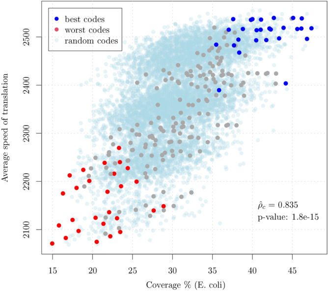
Figure 3.

Average speed of translation versus Coverage (percent) for the 216 circular codes partitioned in 27 equivalence classes of 8 codes each. The points in blue and red correspond to the 27 best and 27 worst codes (corresponding to the KM transformation of the best codes) within their associated equivalence class. Clearly, the coverage is a predictor of the speed of translation and the best and worst codes within their equivalence class clusterize. The results for 8000 random codes are also shown in light blue and the p-value for the test that the observed correlation is equal to that of random codes is reported.
