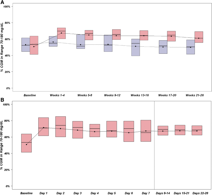
FIG. 2.
(A) TIR over 26 weeks. Blue represents SAP group, N = 23 participants. Red represents CLC group, N = 40 participants. Black dots denote mean values, horizontal lines in the boxes denote medians, and the bottom and top of the boxes represent the 25th and 75th percentiles. (B) TIR during first 28 days in the CLC group. Red represents CLC group, N = 40 participants. Black dots denote mean values, horizontal lines in the boxes are medians, and bottom and top of the boxes represent the 25th and 75th percentiles. The range of the data are narrower after day 8 because it was averaged at a participant level over 7 days instead of 1 day, and consequently there would tend to be less variability in the point estimate for each participant.

