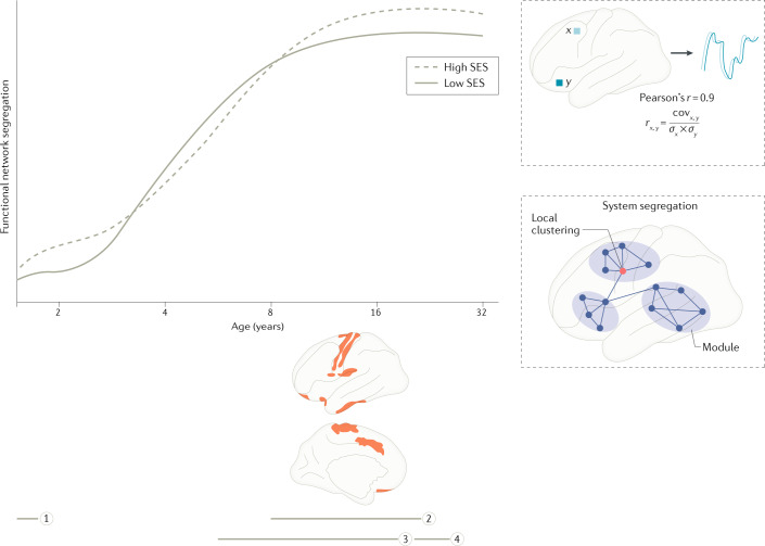
Fig. 2. Associations between socio-economic status and functional brain network segregation.
Trajectories shown in solid and dashed grey lines are conceptual, based on findings interpolated across multiple studies. Horizontal grey lines represent the age ranges of individual studies, as shown on the horizontal axis (grey line 1, ref.63; grey line 2, ref.64; grey line 3; ref.65; grey line 4, ref.196). Brain regions shown in red indicate socio-economic status (SES)-associated differences in functional network segregation, with adolescents from higher-SES backgrounds showing stronger positive associations between age and segregation. Curves are drawn to be consistent with functional network segregation across the studies shown; the studies used a range of measures of segregation, as illustrated in the bottom-right inset. The top-right inset illustrates a common metric of functional connectivity used to estimate functional brain networks: the Pearson product-moment correlation coefficient. Brain images in the lower part of the figure adapted with permission from ref.64, OUP.

