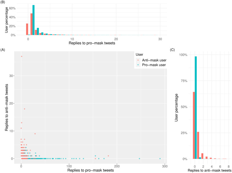
Fig 5.
(A) Scatter plot of each user’s replies to anti- and pro-mask tweets, with each red circle representing an anti-mask user and each teal circle representing a pro-mask user. The horizontal and vertical axes indicate the number of a user’s replies to pro-mask tweets and to anti-mask tweets, respectively. (B) Distributions of replies to pro-mask tweets where the 0-reply teal bar is minimal in contrast to the 0-reply red bar representing over 20% of anti-mask users. (C) Distributions of replies to anti-mask tweets where the 0-reply teal bar representing 99% of pro-mask users sticks out on the horizontal axis, towering over the 0-reply red bar.

