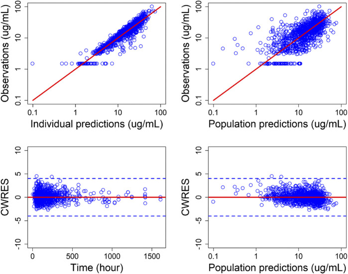
FIGURE 1.
Goodness-of-fit plots for final population PK model. Top: Individual predicted (IPRED) serum concentrations vs. observed concentrations (left) and population predicted (PRED) serum concentrations vs. observed serum concentrations (right). Bottom: conditional weighted residuals (CWRES) vs. time (left) and PRED (right). Points are individual data. Red solid lines represent the unit diagonal (top) or line at zero (bottom). Blue dashed lines represent |CWRES| of 4.

