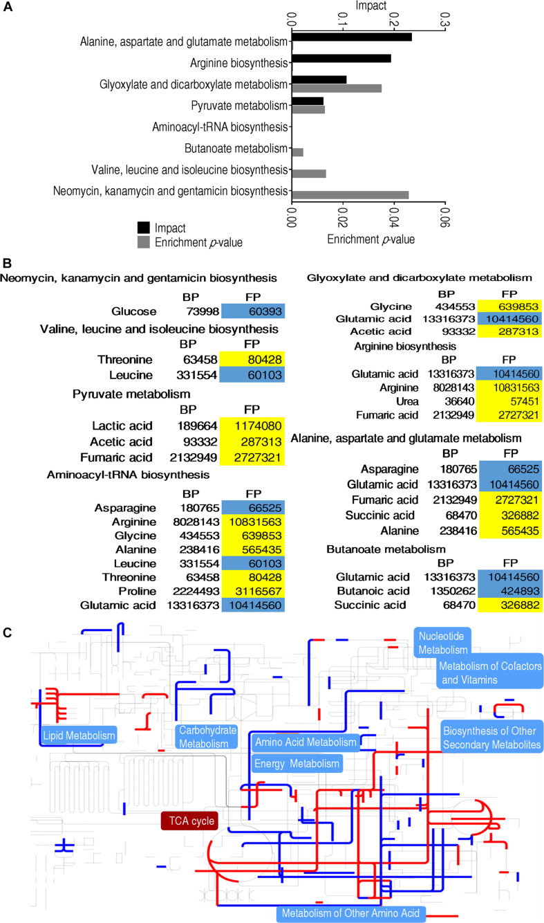
FIGURE 3.
Metabolomic alterations at different groups. (A) Pathway enrichment analysis of differential metabolites that were used for visualization. (B) Heat map of differential metabolites. Yellow indicates an increase in metabolites and blue indicates a decrease, which were represented by the average and standard deviation of the metabolite relative abundance. (C) iPath analysis of the differential metabolites.

