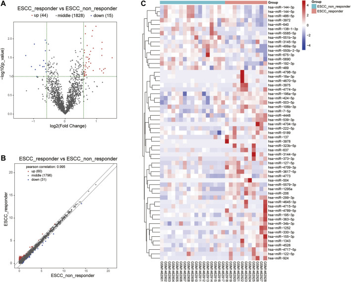
FIGURE 3.
Volcano plot and heat map visualized the differentially expressed miRNA screening between nCRT responders and non-responders. (A, B) Scatter plot and Volcano plot represented the differentially expressed miRNAs found by correlation analysis of ESCC samples. (C) Clustering analysis of differentially expressed miRNAs between nCRT responder and non-responder samples. The color changed from blue to red represented the expression level from low to high.

