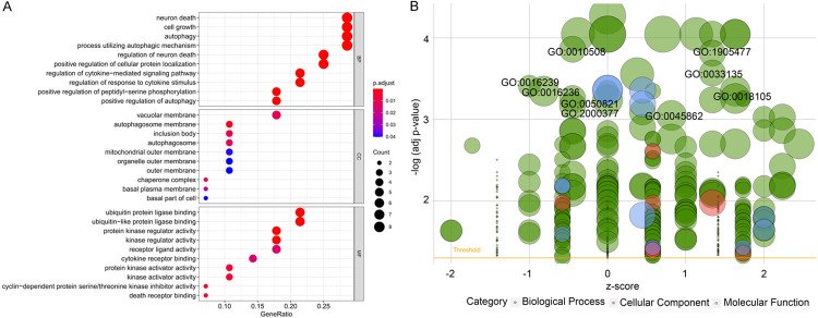
Figure 7.
Results of Gene Ontology (GO) functional annotation analysis. A. Bubble chart of significant terms. The change in colour from blue to red denotes the increase in the adjusted P-value, and the size of the bubble indicates the number of gene enrichment terms. B. Bubble plot of enriched GO terms. The Z-score is plotted on the x-axis and the -log(adjusted p-value) is plotted on the y-axis; green denotes a biological process, red denotes cellular components and blue denotes molecular function. The size of the circles is proportional to the number of genes enriched in the term.

