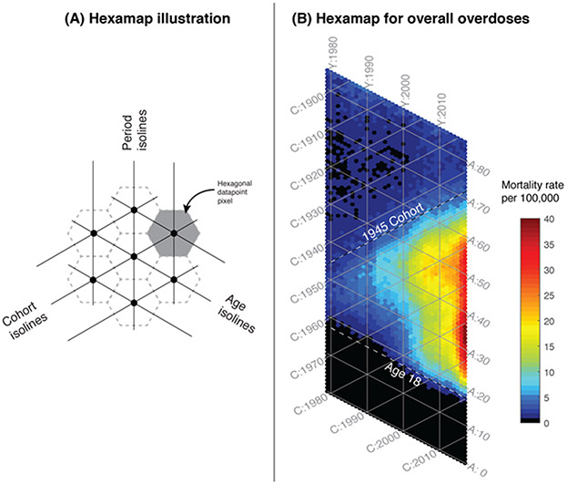
Figure 1.
Hexamaps illustrating the age and generational structure of overdose deaths from 1979 through 2017. (A) Schematic of the components of the hexamap, showing hexagonal data points as defined by age, period and cohort, arrayed along axes at 60 degree angles, and (B) Hexamap of the overall epidemic of overdose deaths where the colors indicate the mortality rates as shown in the legend. The top dashed line is drawn along the isoline of cohort = 1945, and the bottom dashed line is drawn along the isoline of age = 18. These dashed lines represent the boundaries of the wedge-shaped epidemic. [A = age, Y = calendar year, C = cohort].

