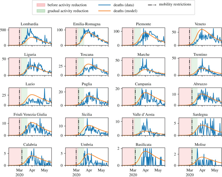
Figure 4.
Results of the model calibration aggregated at the region level. Model parameters are summarized in table 1. The red area denotes the time interval before the implementation of activity reduction. The green area denotes the 15 days in which α decreases linearly from 1 to αlow = 0.176. In the white area, activity is reduced to αlow. The black, dash-dotted vertical line denotes the implementation of mobility restrictions. Orange curves illustrate the predictions from the model; blue curves are actual deaths data from [32].

