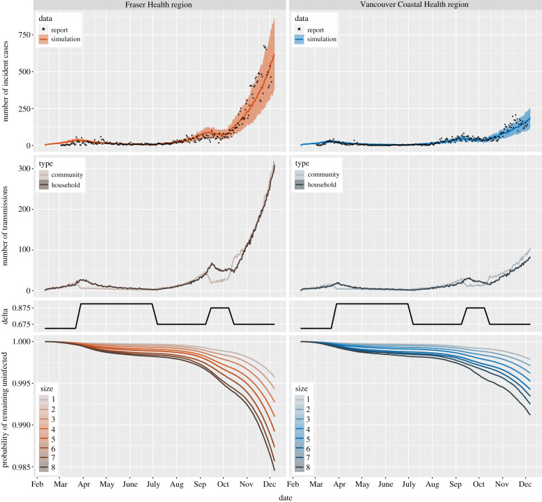
Figure 3.
Top: the number of incident cases from simulation (mean curves with 10–90 percentile range bands) and reported data (points) in the two regions. Middle: the first row displays the number of community and household transmissions from simulations in the two regions; the second row depicts the values of parameter δ described in table 2. Bottom: the survival curves for individuals in households of different sizes from simulations in the two regions. All curves in the figure reflect mean values over 100 runs for each of the simulations. Model parameters are the same in the two regions, except for the household size distribution.

