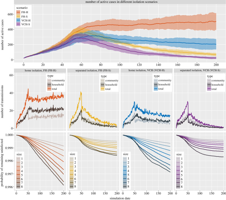
Figure 4.
Results of simulations for isolation scenarios where of the simulated individuals practise home or separated isolation. Top: the number of active cases (mean with 10–90 percentile range bands) in each of the isolation scenarios. Middle: the number of transmissions of different types in each of the isolation scenarios. Bottom: the survival curves for individuals in households of different sizes in each of the isolation scenarios. All curves in the figure reflect mean values over 100 runs of the simulation for each of the isolation scenarios and the settings only differ in household size distribution and the individuals’ isolation preferences. The curves are organized so that warm colours (red and yellow) represent scenarios in FH and cold colours (blue and purple) represent scenarios in VCH.

