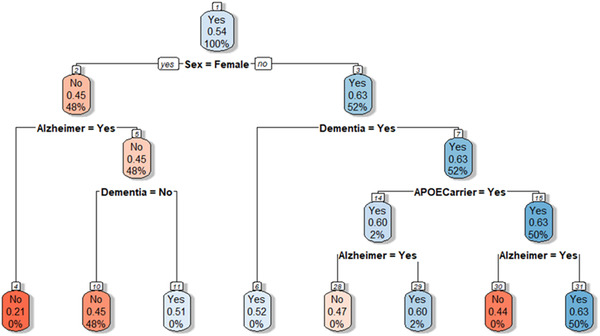
FIGURE 3.

Results of the tree model. Each node shows the predicted class (Yes = treated or No = not treated). Color legend indicates the fitted value. Each tree node reports the predicted class, the predicted probability of the class (i.e., of being treated), and the actual percentage of observations in the node belonging to the class. Branches indicate the value of the variable for which the node was split. For example, the first node includes the whole population, split on the basis of sex; node two indicates the female population, where the probability of being treated is 0.45, the predicted class in “No”; node three indicates the male population, where the probability of being treated is 0.63, the predicted class in “Yes”
