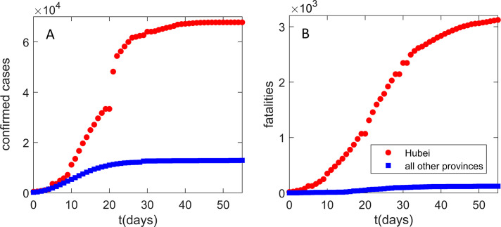
Fig. 1.
Infection and fatality counts for Hubei vs all other provinces. The number of (A) detected infections, (B) fatality cases. Zero on the horizontal axis corresponds to the time from which the data (Hu et al., 2020) are taken (January 23), which also coincides with the Wuhan closure. Red circles correspond to the observed Hubei counts. Blue squares correspond to the sum of the number of counts for all other provinces. The figure illustrates a puzzling difference in the number of counts between Hubei alone and the sum of all other Mainland China provinces.

