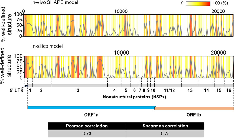
FIG 6.
Comparison between in silico prediction in this study and experimental (in-cell SHAPE) structure reported by Huston et al. 2020 (32) for the ORF1ab region (including the 5′ UTR). The plots (gray lines) show the distribution of well-defined structure (percent high base pair content/low Shannon entropy) calculated in 100-nt bins tiling the ORF1ab region from both structural models. The same values are represented as a heat map in each graph to depict regions of high and low structural content according to the key shown on the upper right-hand corner. A cartoon with the genomic subdivisions of ORF1ab is shown to guide data visualization. The computed correlation coefficients between both data sets are shown in the table.

