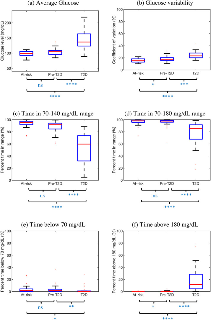
Fig. 2.
Standardized CGM measures for n = 100 participants stratified by HbA1c. Boxplots shown as median (red), interquartile range (blue edges) and total range (black tails). Outliers shown as red dots. P-values for pairwise comparisons computed using Tukey's HSD criterion (ns: not significant, *:p<0.05, ⁎⁎:p<0.01, ⁎⁎⁎:p<0.001, ⁎⁎⁎⁎:p<0.0001). (For interpretation of the references to color in this figure legend, the reader is referred to the web version of this article.)

