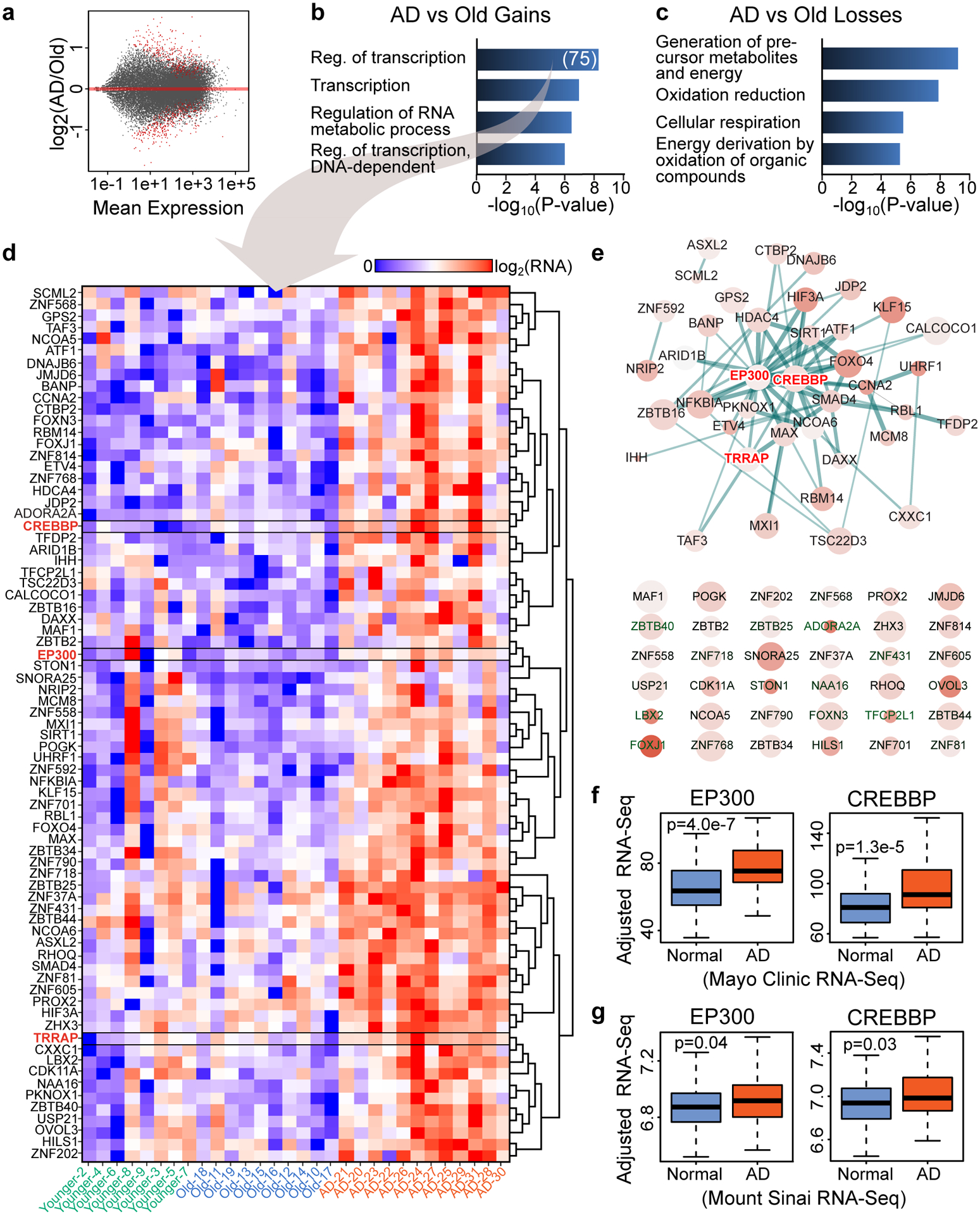
Figure 1. Transcriptomic analysis identifies upregulation of transcription- and chromatin-related genes in AD.

(a) Scatterplot showing gene expression changes vs. Mean expression in the AD vs. Old comparison. Red dots represent significant differentially expressed genes (q < 0.05, DESeq2). (b,c) Barplot showing top GO terms (Biological Process, DAVID, FDR < 10%, Yekutieli) for genes that are significantly (b) upregulated or (c) downregulated in AD vs. Old (q < 0.05, DESeq2). (D) Heatmap showing gene expression in Younger, Old and AD for genes that are in the GO term “Regulation of transcription” in panel b (N = 75). CREBBP, EP300 and TRRAP are highlighted in red. (e) STRING (v11) analysis for the 75 transcription- and chromatin-related genes (in panel d) revealing a protein interaction network of 35 gene products (top) with CREBBP and EP300 at the center of the network. Genes not involved in any interaction are also showed (bottom). The STRING network was visualized using Cytoscape (v3.6) where node size represents gene expression in AD, the color intensity represents gene expression changes in AD vs. Old and the thickness of the lines represents the strength of the STRING interaction. (f,g) Boxplots showing CREBBP and EP300 expression in two published RNA-seq data of control (Normal) and AD brains from (f) the Mayo Clinic (temporal cortex) (N = 203) from Allen et al.43 and (g) the Mount Sinai brain bank (Brodmann area 22 temporal cortex) (N = 160) from Wang et al.44. Boxplots show minimum, first quartile, median (center line), third quartile and maximum. P values (two-sided Wilcoxon rank-sum test) of the comparison between AD and Normal are reported in each panel.
