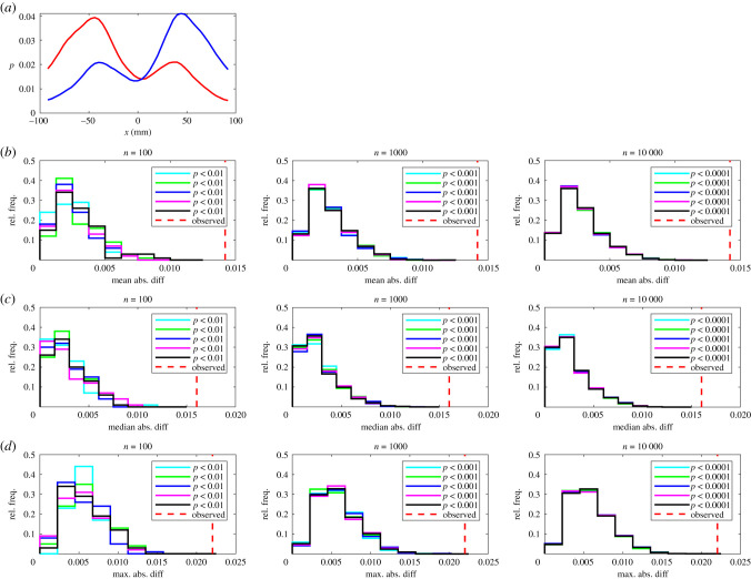
Figure 1.
(a) The relative frequency, p, that partners occupy given x-coordinates for leaders (red curve) and followers (blue curve). In this plot the focal individual is located at the origin, and is travelling parallel to the positive x-axis (from left to right). (b–d) The results of randomization calculations based on mean (b), median (c), or maximum (d) absolute difference tests. The number of iterations, n, performed for each randomization test increases from left to right across the columns of this figure. Within each panel, histograms illustrate the distribution of randomized test statistics for each of five repeat tests (coloured histograms) for each form of test statistic and number of randomization iterations. A vertical dashed red line indicates the observed absolute difference between the fitted functions according to the chosen test statistic. P-values for each repeat test are tabulated in the legend of each panel.

