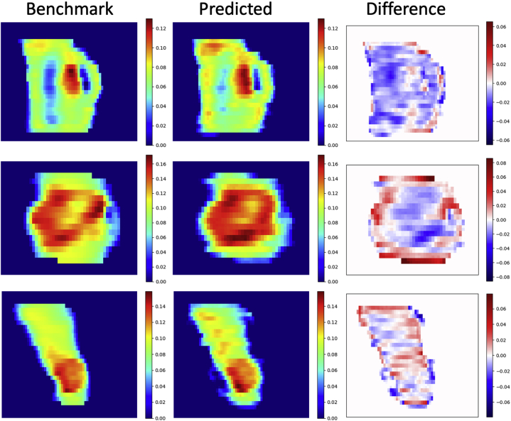
Figure 4.
Fluence map comparisons (left column, benchmark; center column, predicted; right column, difference [benchmark – predicted]). The fluence map pairs were randomly selected from 3 of the 20 test cases. Each pair used the same color map. The predicted fluence maps exhibited similar patterns as the benchmark fluence maps, especially in high fluence regions. (A color version of this figure is available at https://doi.org/10.1016/j.adro.2021.100672.)

