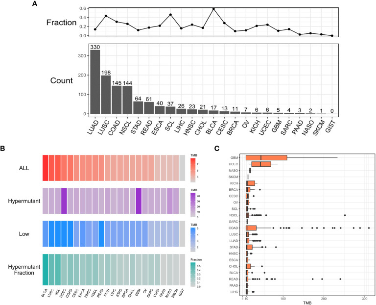
Figure 1.
The distribution of cancer types. (A) Histogram of the number of samples with hypermutation per cancer type. The numbers were sorted from highest to lowest. The line graph shows the proportion of the number of samples with hypermutation to the total number of samples for each cancer type. (B) The median value of TMB in the three sample groups (ALL, Hypermutation, and Low) for each cancer type and the number of Hypermutation samples for each cancer type as a proportion of the total number of samples for that cancer type. (C) The distribution of TMB in samples with hypermutation for each cancer type.

