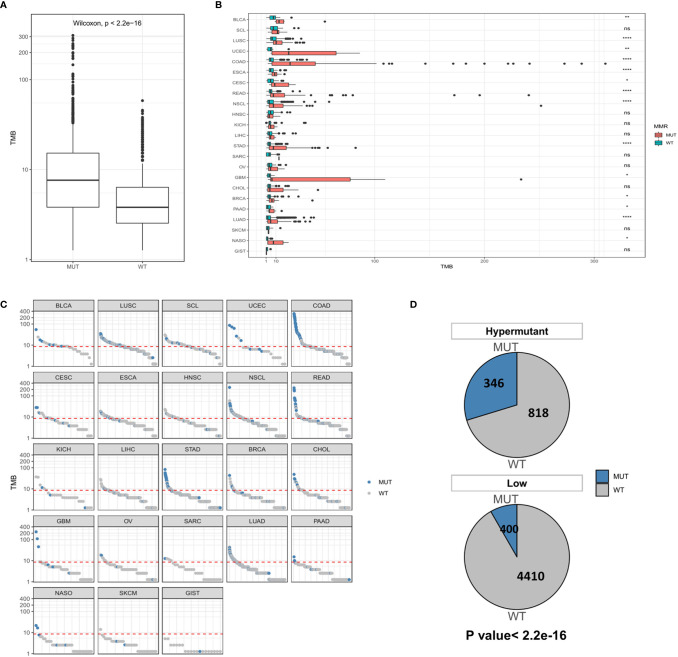
Figure 4.
(A) Comparison of TMB distribution between the MUT group and WT group. (B) The distribution of TMB in the MUT group and WT group for each cancer type. (C) TMB value of each sample in each cancer type. Blue and gray represent samples in the MUT group and those in WT group, respectively. (D) The number and proportion of MUT and WT samples in Hypermutation and Low groups. P < 0.05 was considered a significant difference, * P < 0.05, ** P < 0.01, **** P < 0.0001. NS, not significant.

