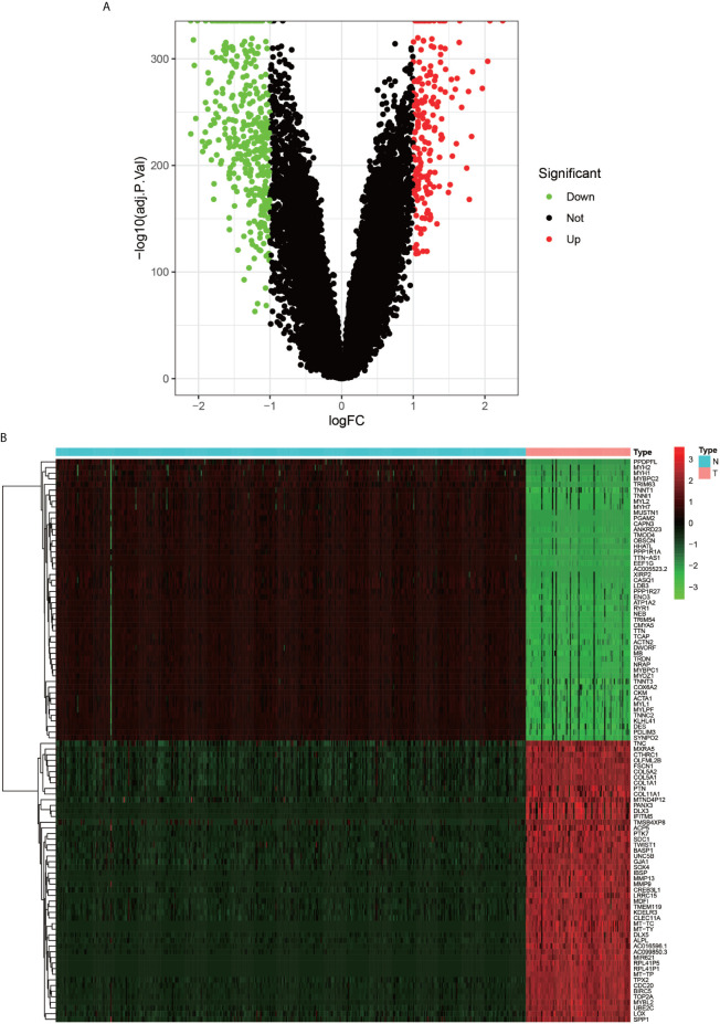
Figure 2.
Volcano plot and Heat map of differentially expressed genes. (A) graph shows a volcano plot of DEGs, with red dots for high expression, green dots for low expression, and black dots for genes that do not meet our requirements. (B) graph shows a heat map of DEGs with normal samples in blue and tumor samples in red in the Type column; high expression genes in red and low expression genes in green in the graph.

