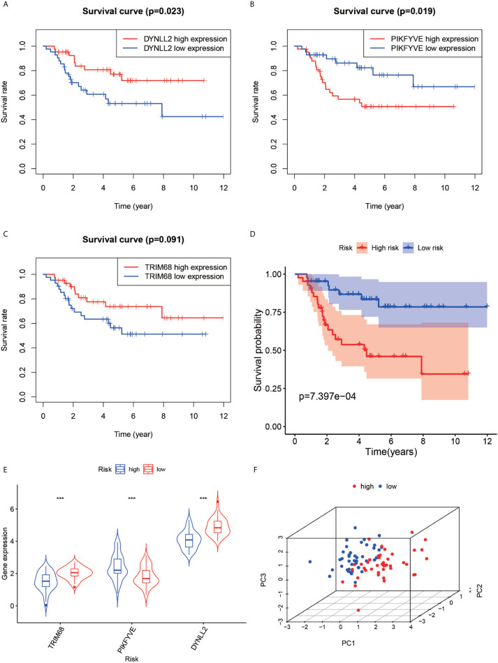
Figure 5.
Survival analysis, violin plot and principal component analysis plot. Plots (A–C) show the survival analysis plots based on these three high and low gene expressions. Plots (D) shows the survival analysis plotted based on the high and low risk of the model. (E, F) show 3D display plots of gene expression and principal component analysis of the model for high and low risk, respectively. “***” Representative P < 0.001.

