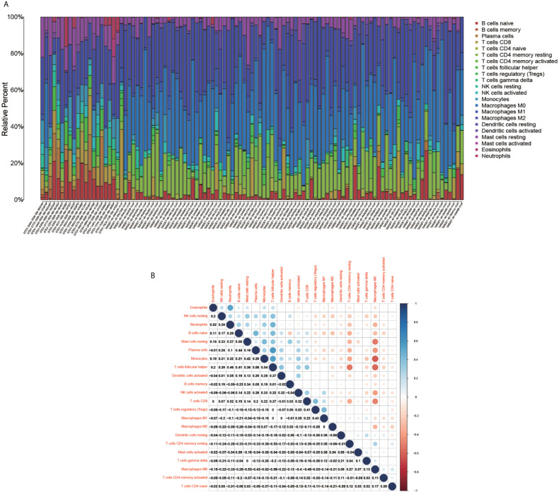
Figure 8.
Immune cell composition diagram and correlation heat map. (A) indicates Histogram showing the composition of the immune cells in each sample. (B) indicates the heat map showing the correlation between individual immune cells, with darker red indicating a stronger positive correlation and darker blue indicating a stronger negative correlation.

