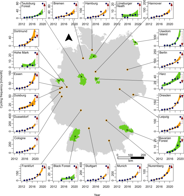
Fig 1. Map of study sites and respective cycling frequency.
Cycling frequency displayed as measured (point) and predicted (plus, Modell A with user numbers as factor) values for the month April for all urban (orange) and rural (green) sample sites. The red dashed arrows indicates a Covid-19 related difference and the direction of change in user frequency. The background shows the outlines of Germany with the locations of focal cities and nature parks [54].

