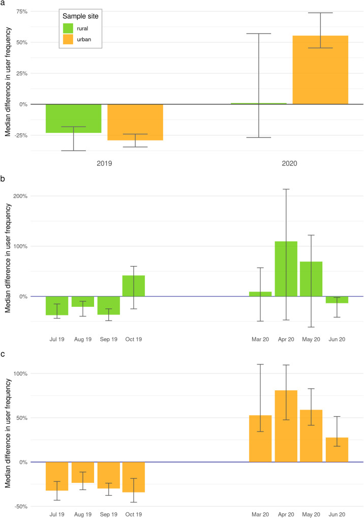
Fig 2. Comparison of urban and rural cycling behaviour.
Graphic a displays a summary of Model A [cycling activity ~ year]. The plot shows the median differences in user frequency, detected in rural (green) and urban (yellow) public green spaces in times with influence of epidemic-control-decisions (2020) and without (2019). Bars indicate mean difference, whiskers show 95% Confidence Intervals. Graphic b and c display median differences in user frequency, calculated by Modell A [cycling activity ~ year]. Graphic b shows results for rural and Graphic c for urban public green spaces in months with influence of epidemic-control-decisions (March–June 2020) and without (July–October 2019).

