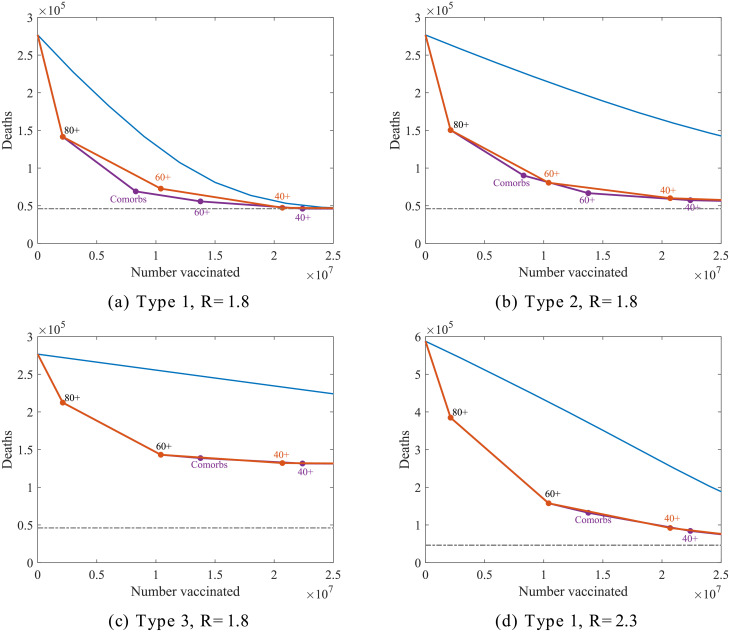
Fig 5. Comparison of vaccination ordering for four different vaccination scenarios.
In each panel, the simulated points represent the number of subsequent deaths expected after vaccinating everyone up to a given group following an optimum strategy (identified by giving greatest reduction in deaths per vaccination in each instance) represented by the purple and orange connecting lines. Here the purple line shows the path of the optimum vaccination ordering of groups comprising of 20 year age bands together with comorbidities across all ages, and the orange line for age groupings only. The blue lines show an unbiased strategy with vaccinated numbers dispersed evenly across the population and the grey dotted line show the base level of morbidity from the first infection wave.

