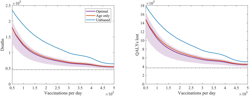
Fig 8. The total number of (left) deaths and (right) QALYs lost following the start of vaccination vs speed of deployment for a type 1 vaccination with 70% uptake and 70% efficacy.
Vaccine deployment is started 2 months after stricter NPIs are relaxed to leave low level measures sufficient to keep R ≈ 1.8. The purple line (and shaded prediction region) represents projected outcomes under the identified optimal ordering with age and comorbidity groups, the orange line outcomes using the identified optimal ordering accounting for age groups only (without comorbidity), and the blue line outcomes with an unbiased population wide delivery. The grey dotted lines show the base level of mortality or QALYs lost, as applicable, from the first wave of the pandemic in the UK in the first half of 2020.

