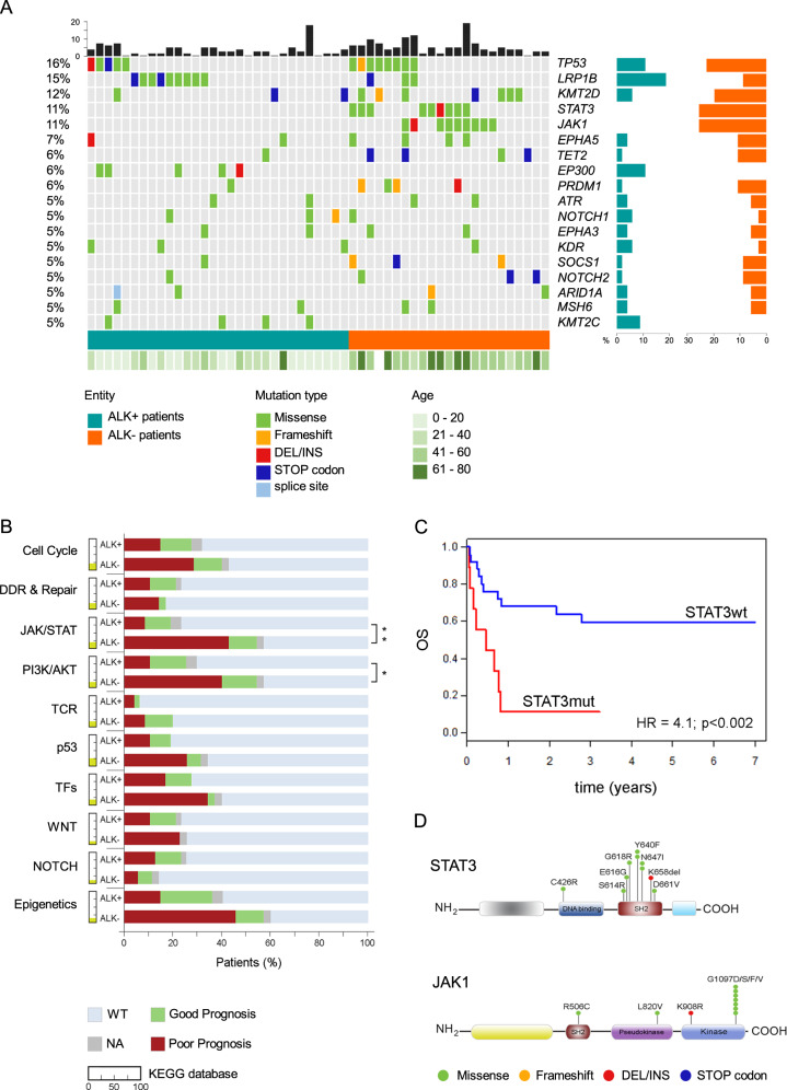
Fig. 1. Mutational landscape in sALCL reveals prognostic biomarkers.
a Oncoplot shows the genes mutated in at least 5% of the entire cohort. The percentage is shown on the left axis. Each column represents a patient, ALK+ in dark green and ALK− ALCL patients in dark orange. The black bars on the top represent the number of mutated genes in each patient. On the right axis, the frequency of mutated gene in ALK+ (dark green) and ALK− (dark orange) ALCL patients. The green bar on the bottom shows the age of each patient. Mutation types are represented in different colors as shown in the legend. b Percentage of patients harboring at least one mutated gene in ten biological pathways. The yellow colored portion next to each pathway indicates the percentage of genes present in our panel that belong to that specific pathway according to the KEGG database. For each pathway shown, the patients are divided according to prognosis; red: patients with poor prognosis; green: patients with good prognosis; gray: patients for whom clinical information is not available (NA); light blue patients wildtype (WT) that do not harbor mutated genes in that specific pathway. The patients are represented as percentage of the total. DDR and repair DNA damage response and repair pathway, TFs transcription factors. Fisher’s exact test: *p < 0.05, **p < 0.01 and ***p < 0.001. c 7-year OS of ALK− ALCL patients according to STAT3 status: STAT3 mutated (red) versus STAT3 wt (blue). P values and hazard ratios (HR) shown were determined by the Cox proportional hazards model. d Schematic representation of STAT3 and JAK1 domains and the position of the variants.

