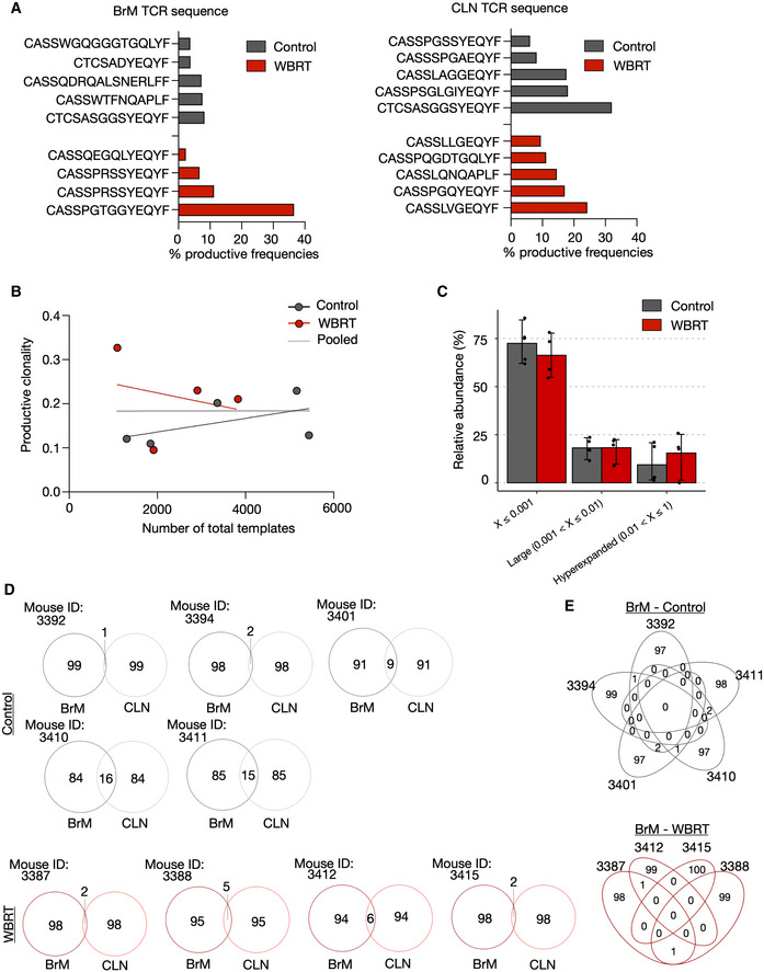
Figure EV3. Top T‐cell clones and clonal overlap in BrM and CLN.

- Bar graphs depict the percentage of the top clone from the total T‐cell pool in the individual samples.
- Productive clonality of BrM samples plotted against total templates to exclude a correlation.
- Comparison of relative abundance of clones with a specific frequency in control and WBRT BrM samples. Values are depicted as scatter plot in bars indicating mean with 95% confidence interval (CI).
- Venn diagrams depict the overlap of the top 100 clones in BrM and CLN samples from the individual mice.
- Overlap of the top 100 clones of BrM samples in the control and WBRT group.
Data information: n = 5 for BrM and CLN from untreated mice, n = 4 for BrM, and n = 5 for CLN from irradiated mice.
Source data are available online for this figure.
