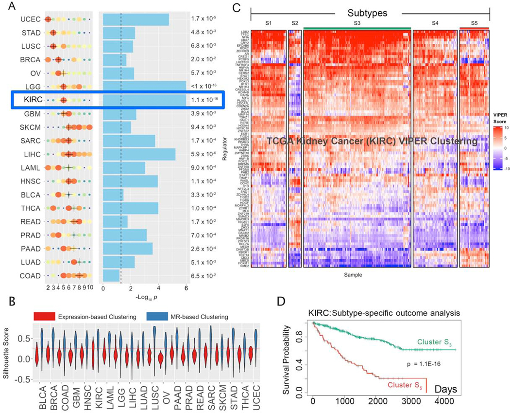
Figure 2. Subtypes inference by network-based integration of gene expression and mutational profile data.
(A) Cohort subtypes identified by MOMA, ranked from the lowest (UCEC) to the highest (COAD) number of optimal subtypes (x-axis). Solution optimality is shown by size and color of the dots, with larger, redder dots representing higher average CRS. The selected solution is marked by a black cross (see STAR Methods for handling ties). Statistical significance of survival separation between the best and worst clusters, by Kaplan Meier analysis, is shown next to the blue bars that represent the -Log10 p. The dashed line represents p = 0.05. (B) Violin plots representing the Silhouette Score probability density (y-axis) for each of the 20 TCGA tissue types (x-axis) for the optimal clustering solution, as inferred by either MR-based (blue) or expression-based (red) cluster analysis. A dotted red line indicates the standard statistical significance threshold (SS = 0.25). (C) MR-based clustering heatmap for the TCGA kidney clear cell carcinoma cohort (KIRC). Rows represent Tumor Checkpoint MR proteins, while columns represent individual samples. Color scale is proportional to protein activity (red activated; blue inactivated). (D) Cox-proportional hazard analysis of patient survival in subtype S5 (red line) vs. S3 (green line) (p = 1.1×10⁻¹⁶).

