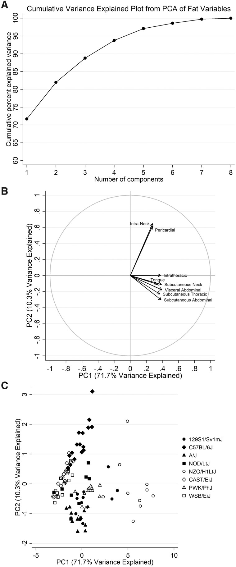
Figure 4 Graphical summaries of principal components analysis. Graphs summarizing the results of the principal components analysis of individual fat distribution measures are shown, including (A) the cumulative variance explained, (B) a factor loading plot, and (C) a scatter plot. As shown in the plot of cumulative variance explained, the first two principal components explain >80% of the variability in fat distribution measures. The factor loading plot illustrates the relative correlations of each fat distribution with the two components, showing that all measures are positively correlated with PC1, whereas only intra-neck fat and pericardial fat are positively correlated with PC2. Finally, the scatter plot shows the values for individual mice of each strain.

An official website of the United States government
Here's how you know
Official websites use .gov
A
.gov website belongs to an official
government organization in the United States.
Secure .gov websites use HTTPS
A lock (
) or https:// means you've safely
connected to the .gov website. Share sensitive
information only on official, secure websites.
